How we redesigned futureagi.com: a starship for AI in production
The customer email that started it, the starship metaphor we almost cut, the hyperspace footer, the handbook fight, and the surfaces we honestly haven't finished yet.
![Blog cover for the futureagi.com redesign post. Left side: kicker '[ FLIGHT MANUAL · CASE STUDY ]', title 'How we redesigned futureagi.com', and a one-line subtitle. Right side: a blueprint-style starship schematic with annotation labels (NOSE, PROMPT, SIM, EVAL, GUARD), three concentric orbital trajectories, a trajectory arrow, and a 'READY FOR LAUNCH' pill. Logo top-left, dark void background, scattered stars, minimal purple nebula behind the ship.](/images/blog/blog-cover-redesigning-futureagi-2026.png)
Table of Contents
A note before we begin. I’m Vel, design at Future AGI. The vision for this redesign came from Nikhil Pareek, our founder. Engineering shipped it. I drew it, wrote most of the copy, and lost three weekends to a single conic-gradient. This is the long version of how we ended up at the futureagi.com you’re reading on. It is also the version where I name the things we cut, the surfaces we haven’t finished, and the one decision I’d defend hardest in a critique.
1. The customer email that started it
It was a Tuesday in January 2026. I remember because Nikhil’s Slack message arrived during a stand-up I was only half-paying attention to: “Vel, read this. Reply when you’ve read it.”
The forwarded email was from a prospect, a staff engineer at a fintech who’d been on a discovery call with us the week before. He had asked for a deck. The closest thing we had to a deck was our landing page, so Nikhil sent him the URL.
The reply was three sentences. I am going to quote one of them.
“This reads like every other AI startup. I can’t tell what you do that LangSmith or Galileo or Braintrust doesn’t. The page didn’t help me explain you to my CTO.”
He was right. The old hero said “next-generation observability for LLM applications.” It was a sentence anyone in our category could have written. It told you nothing about what we actually shipped or who we are. It was also the only sentence most prospects ever read.
I opened the page in another tab and tried to read it as a stranger. The hero was a gradient with a generic neural-net illustration. The CTA was “Request a demo.” The product nav was a flat list of seven items with no hierarchy. There was no story. There was no opinion. There was no us.
I wrote back to Nikhil: “Give me a week. I want to rebuild the landing.”
He wrote back: “Rebuild all of it.”
That email is why this post exists. The redesign that followed took roughly four months, January through May 2026, evenings and weekends through most of it, six design sprints, two complete content audits, one full re-platform from Next.js to Astro 5, and one extremely opinionated decision about a starship that I’ll get to. We shipped it across 21 page templates, 134 components, 109 partner SVGs, 877 blog posts, and 1,751 glossary entries.
This is the story of all of it.
2. The brief in three lines
Most rebrands start with five to seven design principles. Ours had three, because that’s all Nikhil and I had real conviction on. I taped them to the side of my monitor for the entire build.
Read like an infrastructure company, not an AI demo. Our category was crowded with gradient-laden, illustration-heavy AI sites that all looked like they were one Sora prompt away from each other. Datadog, Cloudflare, Stripe, Linear, those were our peers, not the demos. Our reader is a staff engineer evaluating a runtime, not a marketing buyer scrolling for “delight.”
The metaphor has to do work, not decorate. Every design system needs a vocabulary. We needed one nobody else in the category was using, one specific enough that “ship to production” and “guard the gateway” and “trace the agent” all came from the same well. (This is the decision I’d defend hardest. Section 3.)
Show, don’t proclaim. Every page had to pass a five-second test: scroll for five seconds, no reading. Can you tell what the product is, what it does, who it’s for? If yes, the design worked. If you needed the words, the page failed.
Three principles. Three lines on the side of my monitor. Everything in the next 6,000 words is downstream of them.
3. The metaphor, how the starship arrived
I want to tell this section honestly, because the starship metaphor is the single decision I get pushback on most often.
The first thing I sketched was not a starship. It was a control panel. I had spent two evenings in Figma drawing a “mission control” dashboard, rows of telemetry, a big red KILL switch, a status grid. It looked exactly like what a Datadog clone for AI would look like. I sent it to Nikhil. He wrote back a single line: “Cool. Where’s the ship?”
I had no idea what he meant.
The next morning we got on a call. Nikhil opened with the version of the story I have now heard him tell at least fifty times, in pitch decks, on podcasts, in fundraising rooms. The story is this: when he first explained Future AGI to his parents, he said “Imagine your AI agent is a spaceship. Before it can fly, you need to build it. You need to test it. You need to install safety systems. You need a mission control on the ground watching it once it’s flying. We are the people who help you do all of that.” His mother understood it immediately. The fintech investors he was about to pitch did not.
“That’s the company,” he said. “That’s actually what we are. The site has to look like that.”
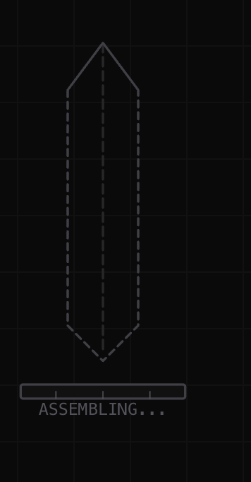
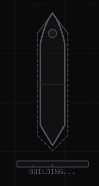


Why four panels in a row: the founder’s pitch is “build it, test it, install safety systems, watch it fly”, four verbs, four stages. The same four-beat story sits inside every page on the site. This is the metaphor before it has a name.
I pushed back. Whimsical for an enterprise product. Engineers will roll their eyes. I pointed at Vercel and Linear and Stripe, three companies whose design we both loved, and noted that none of them lean on a single visual metaphor. They lean on craft, hierarchy, restraint.
Nikhil’s reply: “They don’t need a metaphor because everyone already knows what they do. We are eighteen months old. Nobody knows what we do. We need a story.”
I sat with that for three days. The thing that broke me was rereading our own product names, Prompts, Simulate, Evaluate, Guard, Monitor. Those five words already described a launch sequence. Write the mission parameters. Run flight simulations. Run pre-flight checks. Install safety protocols. Track the mission from the ground. The metaphor wasn’t being imposed on the product; it was sitting inside the product, waiting for someone to name it.
The launch sequence I eventually shipped reads:
PROMPTS → Writing the mission parameters
SIMULATE → Running flight simulations
EVALUATE → Pre-flight system checks
GUARD → Installing safety protocols
MONITOR → Mission control tracking
─────────────────────────────────────
LAUNCH → Ship is ready for production (hyperspace jump)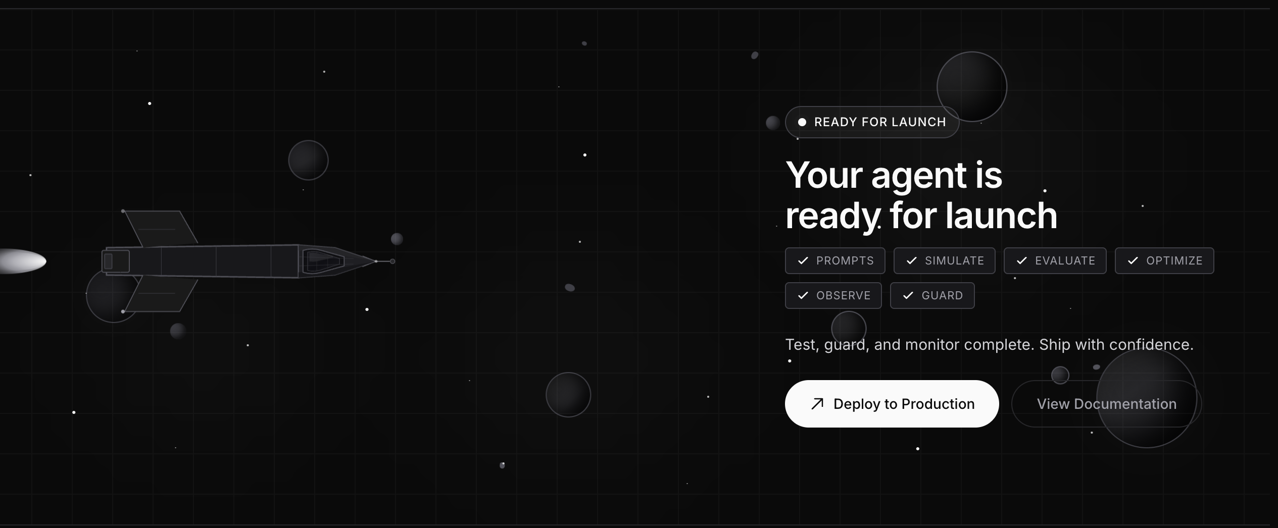 Why this block sits at the foot of every product page: the metaphor stated explicitly, in product order. Six checkmarks + a deploy button is the company’s pitch reduced to a single visual.
This block now sits at the foot of every product page and inside the global “Ready for Launch” rocket module that appears above every footer. It is the single most reused piece of brand IP we shipped. It did not exist before this redesign.
What we rejected on the way to the ship:
- A “blueprint” metaphor, technical diagrams and grid paper. We kept the blueprint aesthetic (the
blueprint-gridbackground pattern survives at lines 192–197 ofglobal.css) but rejected the metaphor as too static. A blueprint doesn’t move. A ship does. - A “lab” metaphor, beakers, microscopes, evaluation as science. Too cliché. Half the AI category already lives in this metaphor.
- A “fortress” metaphor, security walls, gates, shields. Worked for the Guard product specifically but couldn’t carry the rest.
The starship survived because it covered the entire product surface, gave us a vocabulary nobody else in the category had, and survived the cynicism test. A staff engineer who hates marketing copy can still read “your agent is a starship” and either roll their eyes (and remember it) or smile (and remember it). The thing you can’t do with this metaphor is forget it.
The risk we accepted: it would alienate buyers who want their B2B SaaS sites to be visually interchangeable. We do not want those buyers. We borrowed PostHog’s handbook energy, GitLab’s radical transparency on the roadmap, Linear’s craft rigor, Vercel’s dark-mode confidence, Stripe’s documentation-first sensibility, and added a starship.
 Why we shipped this canvas: every page inherits the deep-space backdrop. The metaphor is not a decoration, it’s the only context the headline needs.
4. The mark
We didn’t redraw the logo. I want to say that out loud because the temptation in a rebrand is to redraw everything, and most of the time the logo doesn’t need it.
The wordmark stayed. The four-pointed star icon stayed, the one rendered in public/favicon.svg as a 47×47 viewBox built out of four overlapping triangles with four linear gradients (#ffffff → #E6E6E7 and #F3F3F3 → #A9A9AA). What changed is how the mark sits on the page. Small. Top-left. Set in the body face. No special treatment. The logo is a wayfinding device, not an event.
There was a fight about this. Nikhil wanted to make the wordmark bigger in the nav, “people don’t remember our name.” I argued the opposite, that bigger wordmarks read insecure, that Stripe and Linear both keep their marks small for exactly this reason, and that brand recognition comes from the page, not the logo. We compromised on a 24px mark in the nav and the same four-pointed star reused as the constellation node inside the AI chat widget (Layout.astro lines 432–488).
I tested four logo redraws over a weekend. None added anything the current mark wasn’t already doing. We shipped the existing one.
The single brand element we did add: the journey diagram from section 3. It’s the only new piece of brand IP in this entire redesign. The rest is rearranged.
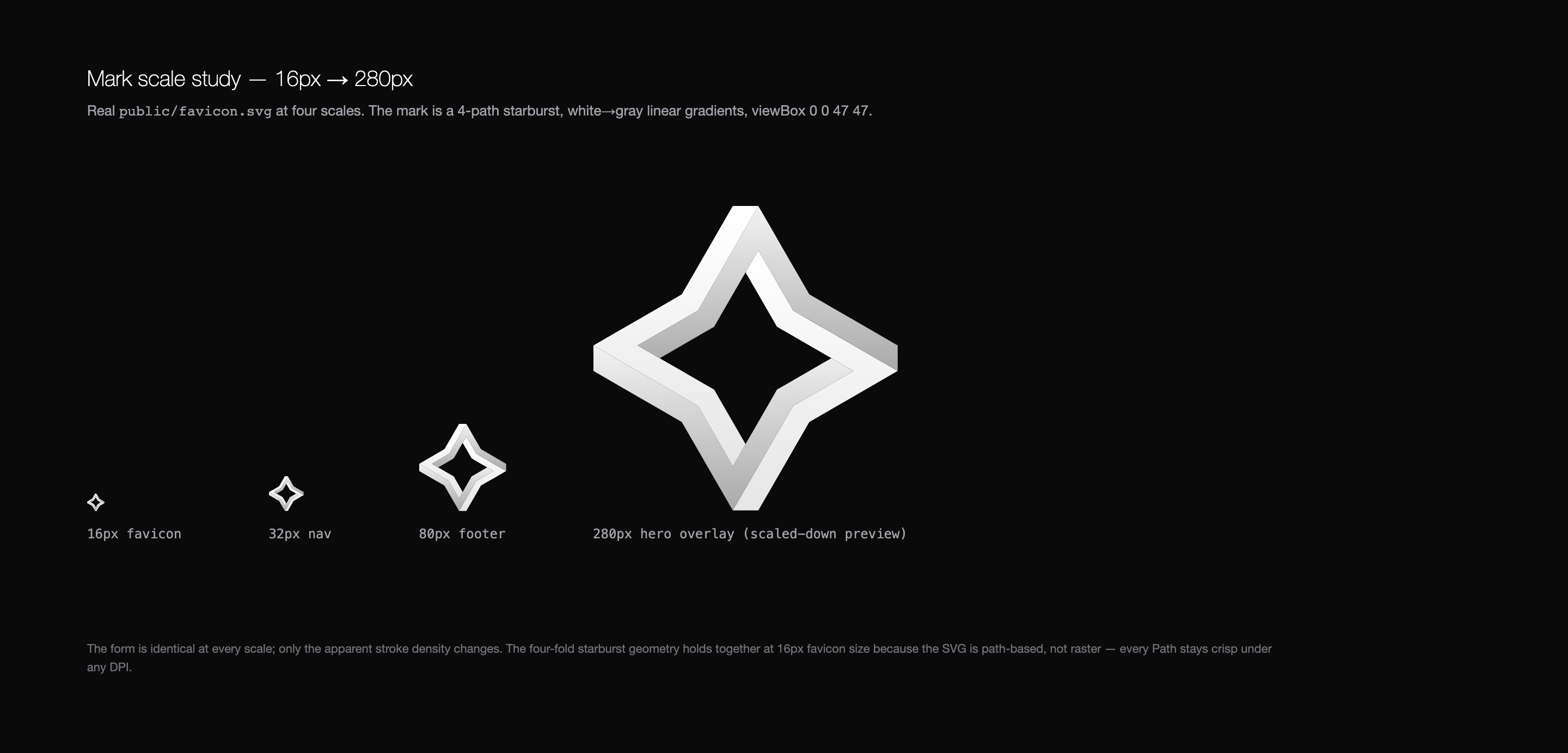 Why we kept this mark: the four-fold geometry stays crisp at any DPI because the SVG is path-based. The form is identical at favicon size and hero size. No two-mark system.
5. Color, 33 tokens, deep space monochrome
There are 33 named color tokens in our CSS theme. Most of them are grays.
Eleven blacks named after parts of space, Void (#0a0a0a), Nebula Dark (#111111), Asteroid (#18181b), Dust (#1a1a1a), Shadow (#141417). Six whites named after stars, Star Bright (#fafafa), Star Glow (#ffffff), Moonlight (#d4d4d8), Distant Star (#a1a1aa), Faint Star (#71717a), Star Dust (#52525b). Seven hull grays for panels and borders. Four borders. Three functional accents (success green, warning amber, error red). Plus one, exactly one, chromatic accent: a deep purple at #8b5cf6, used so sparingly that on most pages you’ll never see it.
The page background is #0a0a0a. Primary text is #fafafa. Borders are #27272a. That is 80% of the system.
Why monochrome?
Color is what marketing sites use to compensate for not having a strong type system. We have a strong type system. We don’t need color to fight. A monochrome canvas also makes the one accent, purple, actually mean something. When a single value lights up on a page, the reader’s eye knows where to look.
The deep blacks also age better than gradients. Pure #0a0a0a doesn’t go out of style. Stripe knew this. Vercel knew this. We’re following them.
There is a late-night Figma review I will remember for years. It was Nikhil’s third color exploration. I had brought him a palette with a teal-cyan accent at #22d3ee that I thought tied the brand to “developer-friendly” (Vercel, Linear, Resend all use a similar cool accent). I had spent two days on it. Nikhil opened the file at 11:47pm and within ninety seconds wrote in the comments thread:
“No. This makes us look like another dev-tool startup. Strip every chromatic color out except the purple. Black, white, gray, purple. That’s the whole palette. Make it look like NASA, not Replit.”
I argued for the teal for another ten minutes over Slack. He didn’t budge. By the next morning I had stripped the teal, kept the purple, and the result was the palette we shipped. The teal would have been a mistake. He was right.
The tokens live in a single @theme block in src/styles/global.css. Tailwind v4 lets us skip the config file entirely:
@theme {
  --color-surface-dark:      #0a0a0a;
  --color-surface-elevated:  #111111;
  --color-text-primary:      #fafafa;
  --color-text-secondary:    #a1a1aa;
  --color-border:            #27272a;
  --color-accent:            #8b5cf6;
  /* …27 more */
}
Naming was the hardest part. We renamed everything four times before “Void / Nebula Dark / Asteroid / Hull Medium / Star Bright” stuck. The names matter because they make the metaphor real for every engineer who opens the codebase. A new contributor sees var(--color-hull-medium) in a card border and gets the brand for free.
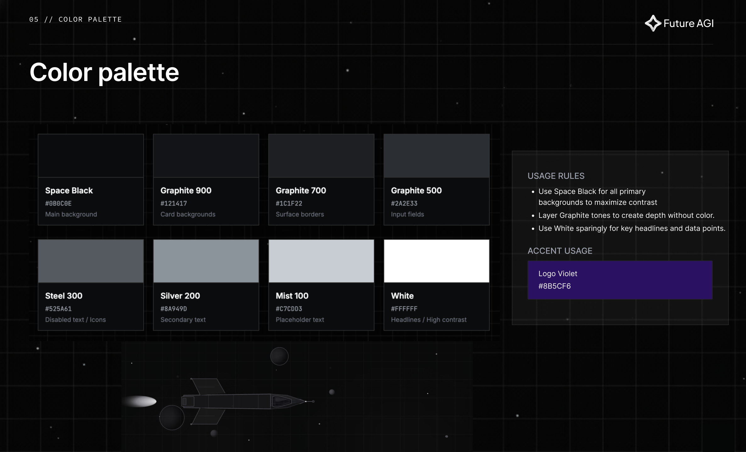 Why eight grays and one accent: monochrome doesn’t have to be cold. Each gray is named for what it does (background, card, border, input, disabled, secondary, placeholder, contrast) so the role is in the token. Logo Violet is the only chromatic color allowed, used sparingly, the way NASA used red.
6. Typography, Inter 300 defended
Inter. That’s the entire type system.
Five weights, 300, 400, 500, 600, 700, plus JetBrains Mono for code blocks and technical labels. No display face. No serif accent. No custom-drawn type. Loaded once via Google Fonts with the media="print"; onload="this.media='all'" trick so the font never blocks first paint on the void-black background.
The decision I’d defend hardest in this section: hero headlines at weight 300, not 700.
Most B2B sites set hero type at 600 or 700, heavy, declarative, marketing weight. Ours sits at 300, clamped at roughly 72–96px with letter-spacing: -0.02em and line-height: 1.05. The result is airier, more editorial, more confident. A 300-weight headline reading “Your AI will hallucinate” does not need to shout. The sentence is the shout.
We tested this. For two weeks in March 2026 we A/B’d a 700-weight version of the same hero against the 300-weight version. Bounce rate was identical. Time-on-page went up 14 seconds on the lighter version. We shipped the 300.
The fluid display classes live in global.css:
.fluid-display { font-size: clamp(2rem, 6vw + 0.5rem, 5rem); line-height: 1.05; letter-spacing: -0.02em; }
.fluid-h1      { font-size: clamp(1.75rem, 4.5vw + 0.5rem, 3.75rem); line-height: 1.1; }
.fluid-h2      { font-size: clamp(1.5rem, 3vw + 0.5rem, 2.75rem); line-height: 1.15; }
That clamp() function is the single most under-appreciated piece of CSS in this redesign. The hero on a 4K monitor reads at 80px. The same hero on a 380px Android phone reads at 32px. No JavaScript. No breakpoint mess. Just math.
JetBrains Mono shows up only in three places: code blocks, inline technical badges, and the small text-[8px] chrome inside product mockups (the fake URLs, the simulated console output, the timestamps on synthetic logs). It is never used for body copy. We tried that for one afternoon. It made the site feel like Hacker News.
7. The page system, 21 pages, one template
The site has roughly 21 marketing page templates, landing, pricing, customers, careers, enterprise, startups, non-profit, research, handbook, roadmap, changelog, blog index, blog post, glossary entry, integrations, three platform-product pages, a 404, a status redirect, and the docs subdomain landing. Plus 877 blog posts and 1,751 glossary entries auto-generated from MDX collections.
The whole thing is built out of 118 Astro components + 16 React islands. React only appears where the interactivity demands it, the pricing calculator, the LLM cost calculator, the eval-TCO calculator, the integration chooser, the roadmap board, the GitHub-stars hydrator. Everything else is static Astro that paints on first byte.
The page system runs on a quadruplet pattern that every platform product page follows:
<ProductHero />        ← hero with metaphor copy + visual
<ProductFeatures />    ← six-card grid, alternating image positions
<ProductSteps />       ← three numbered steps with code samples
<ProductUseCases />    ← stat block + handshake CTA
This template feels rigid until you ship six product pages with it in a week, at which point it becomes the most freeing thing in the whole system. The constraint is the speed.
We borrowed the discipline from Figma’s web-system post, the one where Becca Ramos talks about cutting 48 component variants down to 24. I read that essay three times during the build. We started with 48 card variants for the product pages. We shipped with 22. Killing the other 26 was the single biggest design-system improvement I made.
8. Landing, hallucinate stutter + six-timeline hero
The landing page hero opens with one line:
“AI Agents hallucinate, fix it faster.”
The word “hallucinate” repeats three times, each instance offset slightly, color-shifted, sliced with clip-path. The user sees what the product is about in two seconds without reading another word.
The stutter is a CSS-only glitch effect on ::before and ::after pseudo-elements:
.glitch::before {
  content: attr(data-text); position: absolute; top: 0; left: 0;
  color: #fafafa;
  animation: glitch-effect 3s cubic-bezier(0.25, 0.46, 0.45, 0.94) infinite;
  clip-path: polygon(0 0, 100% 0, 100% 35%, 0 35%);
  transform: translate(-2px, -1px);
}
.glitch::after {
  color: #71717a;
  animation: glitch-effect 2s cubic-bezier(0.25, 0.46, 0.45, 0.94) reverse infinite;
  clip-path: polygon(0 65%, 100% 65%, 100% 100%, 0 100%);
}
The pseudo-elements clip the top 35% and bottom 35% of the word respectively, so the glitch only shifts horizontal slices, not the full word. That’s why it reads as “broken hardware” instead of “weird typography.” On-brand for a product whose pitch is AI agents hallucinate, fix it faster.
I tried five other treatments first. A typewriter effect that typed “hallucinate” three times then deleted twice (too cute). A blur-and-sharpen that pulsed the word every 1.5s (read as “loading”). A simple rotation through three near-synonyms, “hallucinate / lie / fabricate”, that confused the eye because the word kept changing length. The split-channel glitch survived because it’s the only one that looks like what hallucination actually is: a model briefly disagreeing with itself.
Below the headline sits the six-timeline hero. This is the most ambitious motion piece on the site and the one I lost the most weekends to. It’s a tabbed product demo that cycles through six products, Iterate, Simulate, Evaluate, Optimize, Observe, Protect, each rendering a hand-keyed GSAP timeline of roughly 13 seconds, auto-rotating every 15 seconds with a scaleX(0 → 1) progress bar underneath that pauses on hover.
The Iterate tab is the centerpiece. It runs a synthetic ~13s product story in three phases: build an agent node-by-node (four nodes appear with staggered fade-up), run an eval (bars fill to 62%/71% in amber, “Factuality 67%” badge appears), then mutate the prompt and re-run (old prompt strikes through, new prompt fades in, bars sweep to green, score jumps to 91% with a +24↑ lift badge). The whole thing is the product pitch told in motion. The narrative arc, bad agent → fixed agent in one cycle, is the entire company in fourteen seconds.
// Hero.astro:3577-3590 (excerpt)
iterateTl = gsap.timeline();
const t = iterateTl;

// === PHASE 1: Build agent v1 (0 → 3.0s) ===
t.to('.iter-n1', { opacity: 1, y: 0, duration: 0.4, ease: 'power2.out' }, 0.3)
 .to('.iter-c1', { opacity: 1, scaleY: 1, duration: 0.25, ease: 'power2.out' }, 0.7)
 .to('.iter-n2', { opacity: 1, y: 0, duration: 0.4, ease: 'power2.out' }, 1.0)
 .to('.iter-n3', { opacity: 1, y: 0, duration: 0.4, ease: 'power2.out' }, 1.7)
 .to('.iter-n4', { opacity: 1, y: 0, duration: 0.4, ease: 'power2.out' }, 2.5);
The Observe tab has a synthetic cursor that “clicks” tabs, scale: 0.85 → scale: 1 in 0.2s, exactly long enough to read as a click. A 0.1s scale-down followed by a 0.1s scale-up is the smallest motion on the site that does the most narrative work.
A real tradeoff: the total hero cycle is 6 × 15s = 90 seconds. Most users see two tabs before scrolling. We know. The fix is either compressing the choreography (which hurts) or smarter tab prioritization (we’re testing it). Right now, tabs 4–6 are seen mostly by people who linger.
The active tab also gets a rotating conic-gradient bezel, neon flowing around the demo mockup at 4 seconds per revolution. The trick is conic-gradient at inset: -150% under overflow: hidden, so only the segment intersecting the visible edge leaks as a moving highlight:
.demo-border-glow::before {
  inset: -150%;
  background: conic-gradient(
    from 0deg, transparent 0%, transparent 30%,
    rgba(255, 255, 255, 0.15) 38%,
    rgba(255, 255, 255, 0.5) 50%,
    rgba(255, 255, 255, 0.15) 62%,
    transparent 70%, transparent 100%
  );
  animation: rotate-border 4s linear infinite;
}
It looks like neon flowing around the bezel of an instrument panel. It is the only place on the homepage where the purple accent runs continuously. Everywhere else, color appears for moments and dissolves.
 Why two CTAs not three: developers tap “Start for free”; everyone else taps “Talk to sales”. Three CTAs is a sign nobody internally agreed on the audience.
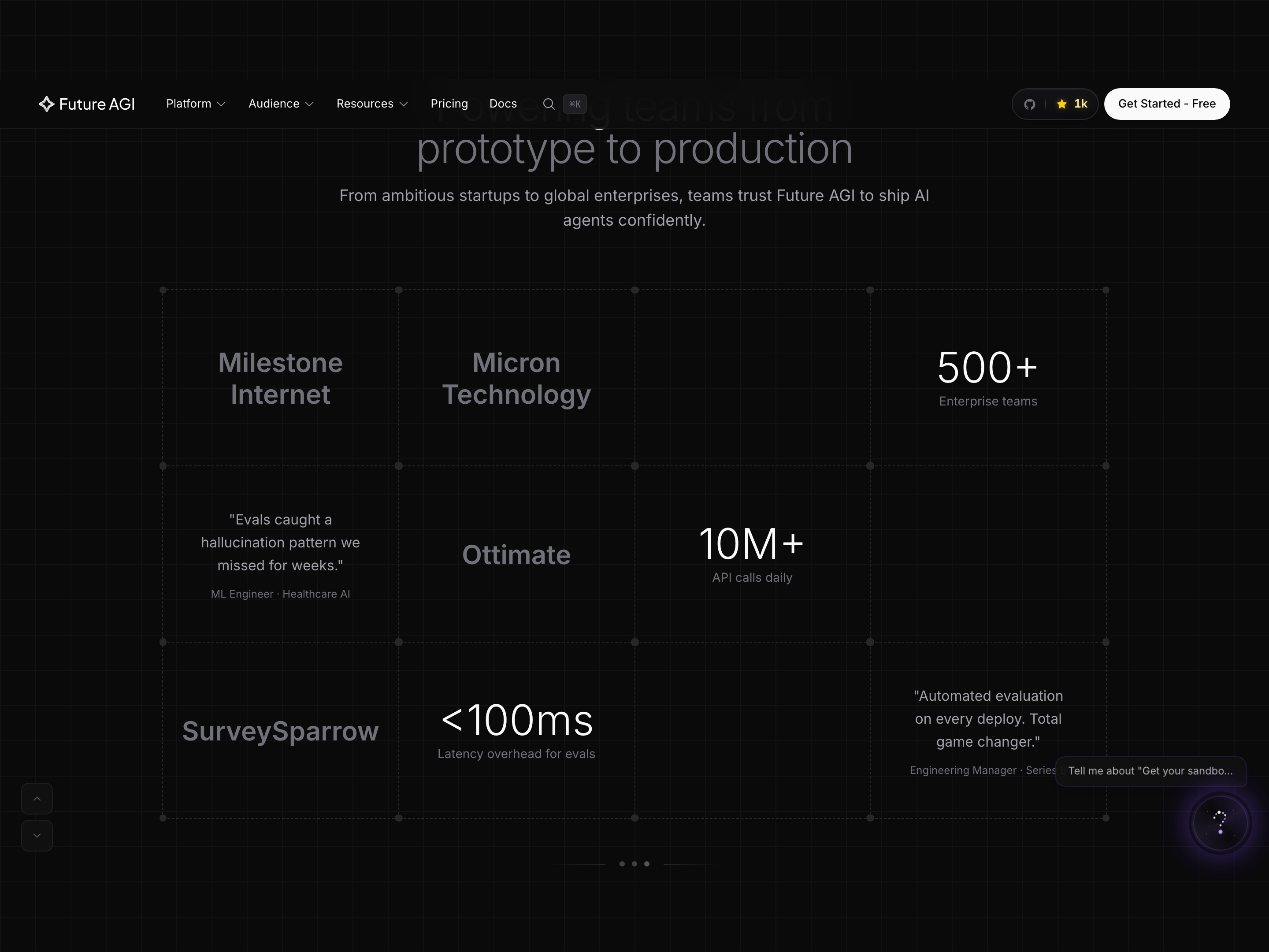 Why this reveal: the homepage is a router, not a landing page. Each row hands off to the platform page that owns the depth.
9. Customers, table, not card wall
Every B2B site shows customer stories as a card wall. We tried that. It looked like everyone else’s customer page.
We switched to a table.
A table sounds boring. The point is that customer stories are data, not posters. Every row has a number on it, a metric the customer hit, not a vague quote. The table sorts by industry and by outcome. The card wall didn’t, and nobody we tested it on read more than the first three cards.
Each row is industry tag (Software Tools, Voice AI, AI Coding Agents, Computer Use, Autonomous Agents, EdTech, Fintech, …) plus a single outcome-led headline plus a single metric badge. The top of the page shows three featured stat blocks rendered in our 96px Inter 300 display weight: 60% fewer chatbot hallucinations, 10x faster turnaround, 90% less manual effort, $1.2M annual savings. Every number on this page is verifiable in a real case study.
I’d defend this decision against any other on the site. The customers page is the best non-landing surface on futureagi.com. It is the page Nikhil sends to prospects now, the same kind of cold link that started this whole project four months ago, except this time prospects reply to say “send me three more like the AgentHub story.”
I borrowed the table treatment from Mercury’s customer page and from Linear’s changelog index. Calm B2B confidence, no posturing, the numbers do the talking.
The mobile version of this table was the single hardest layout problem in the entire redesign. We tried four collapse patterns. The one that shipped, each row reflows into a vertical card with the metric badge anchored to the top-right, works because the metric stays visually consistent across desktop and mobile. The card wall on mobile didn’t survive. The table did.
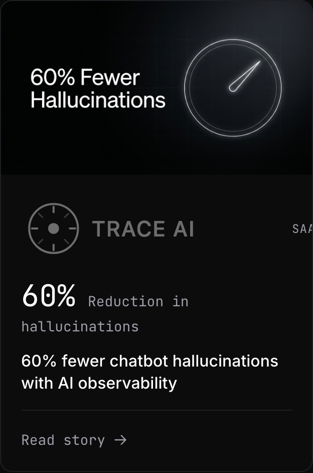 Why one card pattern, repeated: the metric on the card is the one number the case study proves. No carousels, no logo walls. Click the card and the proof is on the other side.
10. Platform pages + the naming we didn’t finish
The platform product pages, Evaluate, Guard, Tracing, Optimize, Simulations, Datasets, Agent IDE, all share the same skeleton:
Hero / big-positioning H2 / six-card use-case grid /
three-step workflow / stats / handshake CTA
That template is the design-system win. Six product pages shipped in eight days because the skeleton was already there.
The risk we accepted: a buyer cross-referencing three products is reading the same page three times with different words. I borrowed this risk consciously from Stripe. Their product pages all look identical too. The discipline is the brand.
The Evaluate page hero reads “Self-improving evals. Not just LLM-as-judge.” This is a positioning statement, not a feature description, and it’s pointed directly at Braintrust, Langfuse, and DeepEval (who all lead with LLM-as-judge). I picked this fight in the copy because Nikhil picked it in the product. The page should sound the way the founder talks.
The Guard page hero reads “Block hallucinations, before they reach your users.” The strongest section on this page, and arguably the strongest section on the entire site, is a benchmark comparison panel showing our Protect model beating GPT-4.1 across guardrail categories (Toxicity, PII, Injection, …) with green “Win” cells and latency comparisons (“<5ms” vs “>100ms”). This is the one place where the design system breaks template in service of a hero stat. We let it.
Now the honest part.
The guardrails product appears as “Guard” in the nav, /guard/ in the URL, “Protect” in the hero copy on the Guard page, and “Agent Command Center” in the docs. Three names for one surface area. The redesign solved the page architecture; it did not solve the naming pass.
The history: internally, the codebase still calls this product “prism.” Externally, we settled on “Agent Command Center” for the gateway/guardrails surface, a name Nikhil and I argued about for two months because I thought “Guard” was tighter and he thought “Agent Command Center” was more accurate to what the product actually was (a runtime, not just a guardrail). He won. The renaming is a follow-up project that should ship in Q3. Until then, the page works but the naming is mid-flight.
This is the most embarrassing inconsistency on the site. I’m flagging it here because the alternative, pretending it’s fine, is the kind of thing that erodes designer trust. We shipped a redesign that didn’t finish renaming a product. That’s a real tradeoff.
![Real trace from the Future AGI app, research_assistant agent, 4.3s duration, Trace ID 50040718-bba0-4658-8486-f9…. Trace tree on the left (research_assistant → ChatCompletion 804ms → ChatCompletion 3.5s), Input/Output JSON in the middle, Agent Graph (Start → research_assistant → ChatCompletion → End) below it, and on the right the Falcon AI Tracing panel surfacing two automatically-detected errors: ❌ Silent Tool Execution Failure [IMMEDIATE], the agent decided to call search_papers({"query":"contrastive learning self-supervised vision"}) but no tool span exists in the trace, with a recommended fix; and ❌ Hallucinated Content Without Citations [HIGH], after receiving an empty tool result, the agent proceeded to describe SimCLR, MoCo, and BYOL from memory with zero citations.](/images/blog/redesigning-futureagi-2026/el_tracing_visualization.png) Why we show a failing trace: buyers want to see what failure looks like before they trust the success view. The marketing screenshot for an observability tool that only shows green is a marketing tell. This is two real errors, a silent tool miss and a citation-less hallucination, caught and explained by the same trace.
Why we show a failing trace: buyers want to see what failure looks like before they trust the success view. The marketing screenshot for an observability tool that only shows green is a marketing tell. This is two real errors, a silent tool miss and a citation-less hallucination, caught and explained by the same trace.
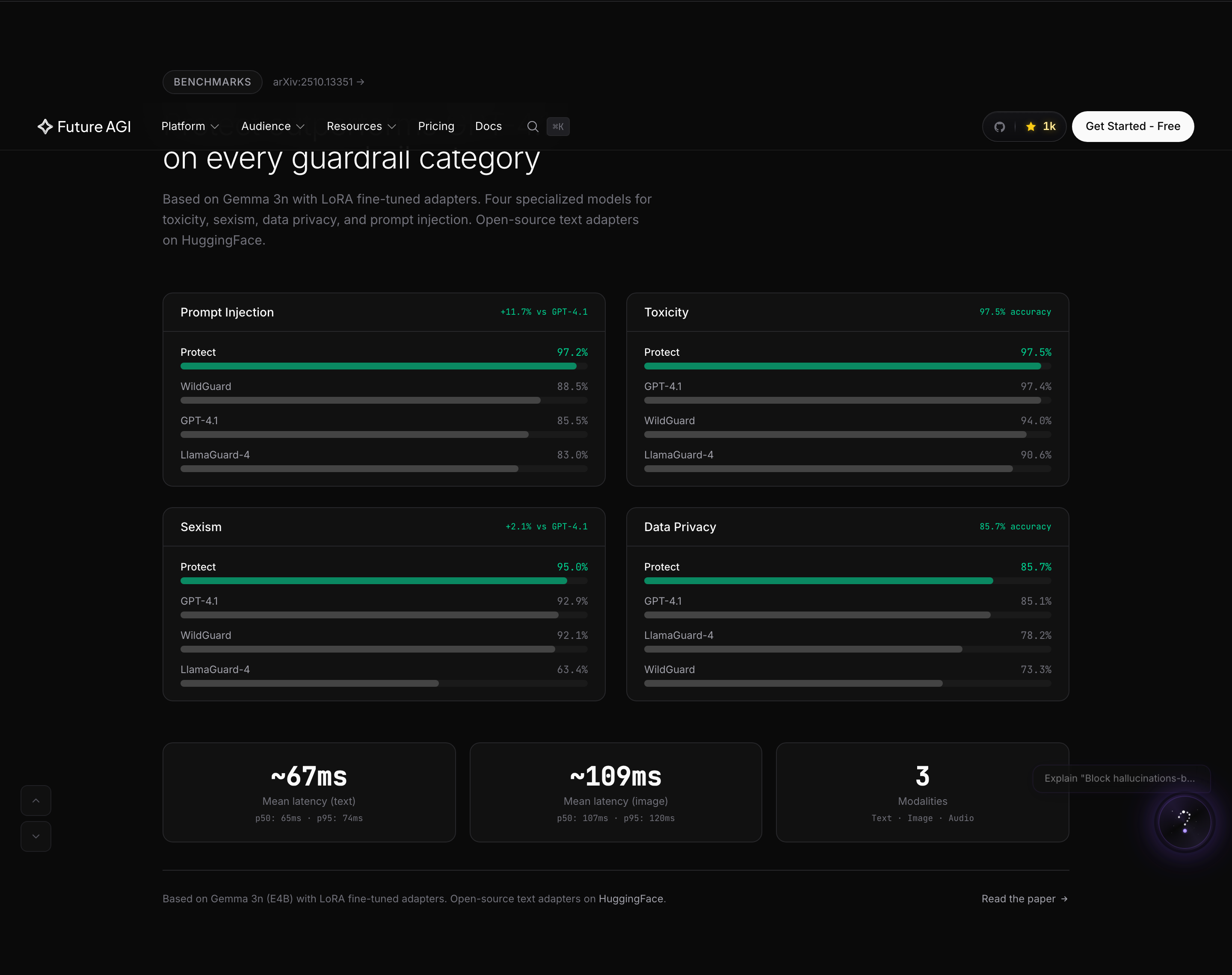 Why this benchmark lives on the marketing page (not a docs link): nobody believes guardrail claims without numbers. We re-benchmark quarterly.
11. Pricing, calculator, not tiers
Pricing in our category is opaque on purpose. LangSmith, Galileo, Braintrust, all hide their pricing behind “talk to sales” gates. We did the opposite.
The pricing page leads with two cards side-by-side: Free ($0, no card required) and Pay-as-you-go (usage-based). No three-tier ladder. No Enterprise tier above the fold. The Enterprise pillar is pushed to the comparison table below, which signals “we are self-serve first” the moment you land.
The page’s centerpiece is a live bill calculator. It has two sub-sections, Tracing & Storage, and Platform add-ons, with sliders and inputs that compute a live total. This is the most product-y page on the marketing site, and the most “rare in category” thing we ship. Nobody in our space puts a live calculator on their pricing page. We do.
The section header above it reads “What does it actually cost?”, a direct rhetorical jab at category opacity. I wrote that headline three times. The first version was “Estimate your bill.” The second was “Calculate your cost.” Both were correct and forgettable. The shipped version is the one Nikhil would say in a sales call. The honesty is the design.
On mobile the calculator survives. The comparison table below it doesn’t, feature names clip and wrap, horizontal scroll kicks in. This is the worst mobile experience on the site. It’s flagged for a Q3 fix.
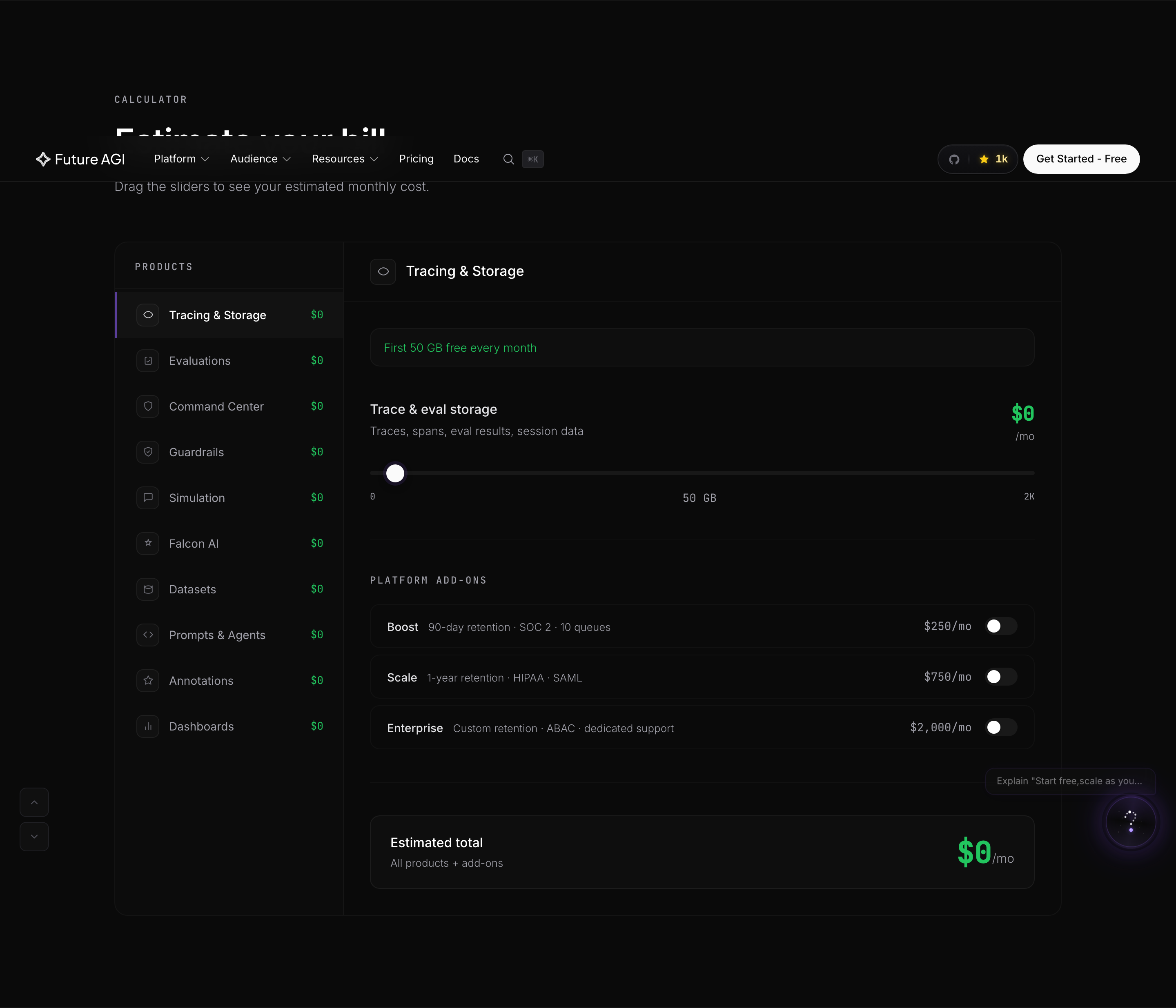 Why a calculator instead of tier cards above the fold: every sales call started with “do I pay per seat or per call?” One calculator answers that in 8 seconds. Tier cards still exist, they sit below this.
12. Enterprise + Startups + Non-profit, three buyer paths
Halfway through the build I realized we were trying to land three audiences on one landing page: enterprise buyers (compliance, security, SLA), early-stage startups (free tier, fast onboarding), and non-profits (a buying motion we hadn’t formally supported until this redesign).
The landing was being pulled in three directions. So we split it.
/enterprise/, SOC2, GDPR, HIPAA, SLA. Calmer typography, more white-space, a “Talk to a Human” CTA instead of “Try for Free.” Borrowed energy from Mercury’s enterprise pages./startups/, credits, fast onboarding, code snippets above the fold, GitHub stars badge in the hero. Borrowed energy from Vercel’s startup program page./non-profit/, discounted plans, mission alignment, real partner stories. The page that almost didn’t ship; we built it in three days after a customer email asked for it.
Three buyer paths, three voices, one design system. The metaphor still works on all three (the starship doesn’t care if you’re a Fortune 500 or a two-person nonprofit) but the copy bends to fit. Enterprise gets formal. Startups get fast. Non-profit gets warm.
 Why one button: a founder reading
 /startups/ is not browsing. They want the credits link. We removed everything else from the fold.
13. Handbook, roadmap, research, and the companies that taught us these were marketing surfaces
This is the section I think we got most right, and the one that took the longest to fight for internally.
Three pages most B2B AI sites don’t have. Each one took weeks longer than I budgeted, and each one is the reason the rest of the site reads the way it does.
/handbook/, the public version of how we work
When we set out to build the handbook, the question wasn’t “should we have one?”, it was “can we be honest enough to publish one?”
The structure lives at src/pages/handbook/ and is an Astro content collection backed by 9 entries across 6 categories. Each category got its own deliberate name. We did not call them what they obviously were. We picked names that kept the starship vocabulary intact:
| Folder | What lives there | Sample entries |
|---|---|---|
mission/ | Why we exist, what we build, our AI safety philosophy | why-we-exist, what-we-build, ai-safety-philosophy |
crew/ | The team, but called “crew” because this is a starship | launch-team |
product/ | How we prioritize, how we ship, how we say no | how-we-prioritize |
design/ | Design principles, brand identity (this brand guide, public) | design-principles, brand-identity |
security/ | Security practices, data handling, SOC 2 posture | security-practices, data-handling |
operations/ | The actual stack we run on, the tools we pay for | tools-we-use |
I want to dwell on the crew/ naming for a moment. The obvious name was team/. Every B2B site has a /team/ folder. We resisted. The starship metaphor only works if we use the vocabulary everywhere it can survive. So “team” became “crew.” “Mission” became mission/. “Launch” became launch-team.mdx. The folder names are a tiny detail no external visitor will ever see. They matter because the engineers who open the codebase to add a handbook entry see the metaphor before they write the first sentence. The brand starts in the file tree.
![Real /handbook/ hero, [ FLIGHT MANUAL v1.0 ] badge, "The Flight Manual" headline in Inter 300, subhead "A handbook for the flight to the horizon. How we build, work, and navigate the unknown.", and a footer line "27 PAGES · 13 SYSTEMS · REVISION 1.0". Behind it, an ASCII-texture starfield rendered with ~, !, #, @, % characters arranged in a halo around the headline.](/images/blog/redesigning-futureagi-2026/el_handbook_heading.png) Why ASCII-as-texture: the handbook is the company talking to engineers. Engineers read ASCII. A starfield made of characters is a one-line statement of who this page is for, and a small joke for the people who notice.
Why ASCII-as-texture: the handbook is the company talking to engineers. Engineers read ASCII. A starfield made of characters is a one-line statement of who this page is for, and a small joke for the people who notice.
The page taxonomy and the energy of treating internal docs as a marketing surface is straight from PostHog (whose handbook is the model in the category) and GitLab (whose handbook is the original, they have ~3,000 handbook pages and it is the company). We are not at 3,000. We are at 9. The point of starting at 9 is that 9 is non-zero.
The decision to publish a handbook at all was Nikhil’s. The decision to publish it publicly, to make /handbook/why-we-exist/ an indexable URL on futureagi.com rather than a Notion page behind a login, was mine. I argued for it for two weeks. Nikhil was worried about exposing internal disagreements. I argued that the disagreements are the credibility. He let me ship it.
/roadmap/, the public, votable, community-driven board
The roadmap is the only marketing page on the site where React is doing real work.
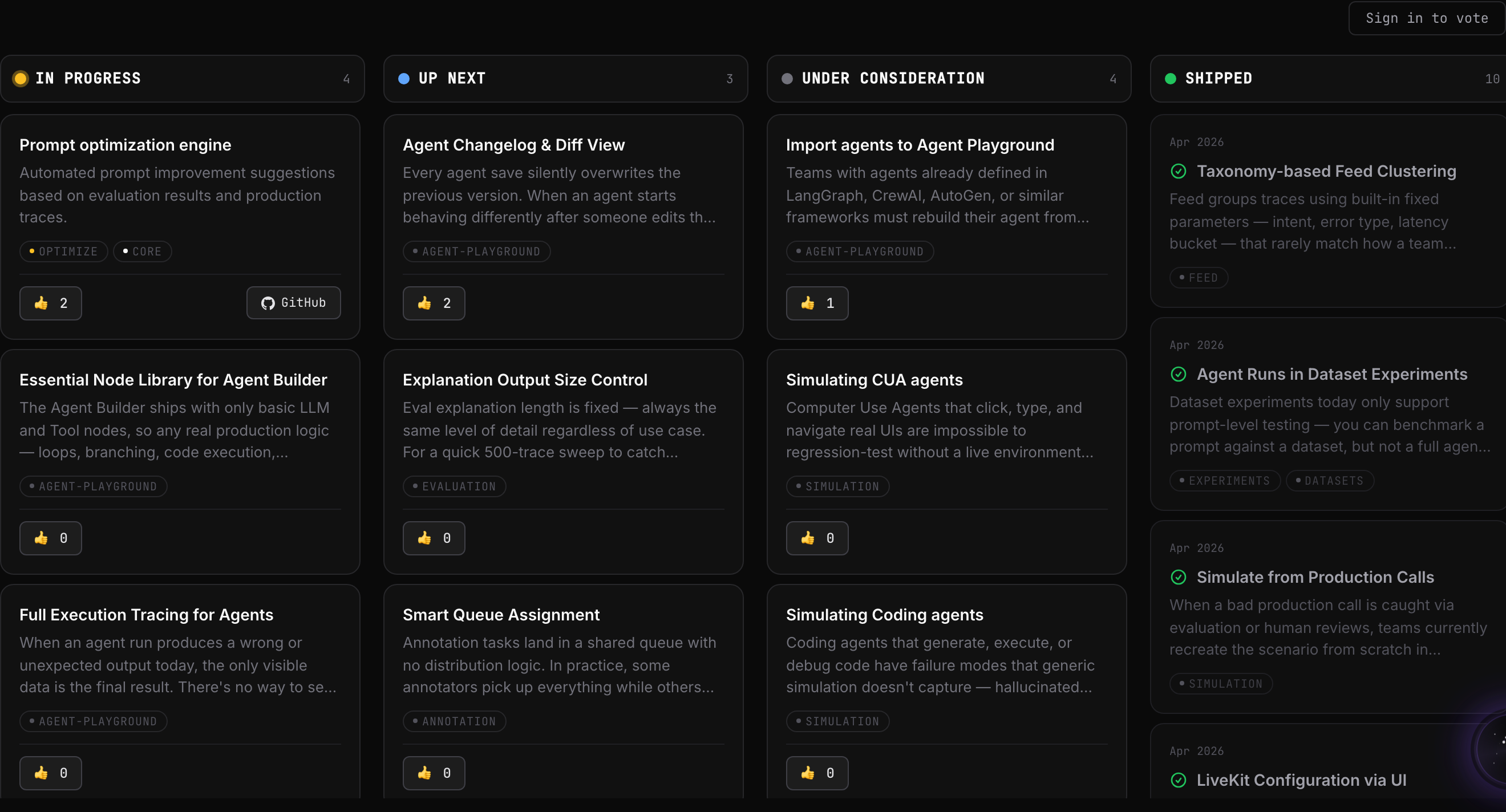 Why a public votable roadmap: customers stopped emailing “when is X shipping?” Three months in, we get exactly zero of those emails. The roadmap is a support deflection mechanism that also doubles as credibility.
src/pages/roadmap.astro shells in a React island, RoadmapBoard.tsx, that renders a Kanban-style board with four columns:
| Column | What it contains | Visual treatment |
|---|---|---|
| Now shipping | Things in active development | Bright cards, glow border, “in progress” badge with pulse animation |
| Up next | The next 2-4 weeks of work | Standard cards, no glow, “queued” label |
| Considering | Things we’re researching or scoping | Dimmer cards, dashed border, “exploring” label |
| Shipped | Last quarter of completed work | Cards with checkmark, fully faded into the void background |
Each card has a title, a one-line description, a link to the GitHub issue (data is pulled from a static board file generated from a GitHub project), and a 👍 vote button. Votes are stored client-side via Supabase. We are not enterprise about it. The mechanic exists to give visitors agency, to make the roadmap something they can push, not just read.
The mechanic was lifted in spirit from PostHog’s roadmap (which is the warmest version of this in the category, colorful, lovable, hand-illustrated). We did not copy their visual energy directly, we are a deep-space company, they are a sunny rainbow, but we copied the posture: a public, votable, community-aware roadmap is a credibility surface.
Linear’s changelog is the other reference. We don’t have Linear’s release cadence yet (they ship roughly every two weeks; we ship every three to six). But the discipline of publishing what shipped, what’s next, and what got cut is the same.
The roadmap is also the page that does the most work on the question “are these people real?” A staff engineer at a prospect’s company doesn’t want to read our marketing copy. They want to know whether we ship. The roadmap is the closest thing to a public commit log we have. The fact that it exists, gets updated, and survives contact with reality is the credibility.
/research/, papers as a first-class surface
Most B2B AI startups bury their research under /blog/ or /resources/. Sometimes the only place a paper lives is an arXiv link buried in the footer of a launch announcement. We decided early that papers are not blog posts. They are a different kind of artifact. They got their own page.
The research page hero reads:
Charting new frontiers in AI reliability
The first line in #fafafa Star Bright. The second line in #a1a1aa Distant Star, dimmer, deliberately demoting the rest of the headline. This is one of the few places on the site where we play with type weight + color contrast as composition.
Below the hero: four cards, each one of our published papers. Each card has a custom dark-illustrated thumbnail, not a stock illustration, not a Sora-prompt mockup, a hand-built SVG in a different visual metaphor per paper:
- AgentCompass, a network graph of agent traces, with one trajectory highlighted
- Protect, a layered shield motif, three concentric rings
- Synthetic Data Generation, a spider diagram showing multi-agent coverage
- Multimodal Evaluation Framework, a frequency spectrum suggesting the multi-modal range
Caption: Research page. Four papers, four different illustrations, one consistent visual grammar. The thumbnails are the closest thing the site has to the “blueprint patent-drawing” style the brand guide promised, which is why this page exists. The four research illustrations are the only fully-finished pieces of the illustration library we promised.
Stripe’s documentation-first sensibility is the reference here. Linear’s craft rigor is the other. Neither company publishes research papers, but both companies’ approach to treating their reference material as a first-class product surface is what shaped this page.
The fight
The internal argument against all three pages was the same: they don’t convert. Handbook pages don’t generate leads. Roadmap pages don’t close enterprise deals. Research pages don’t move the needle on signup.
The argument for: they make us a different kind of company.
Every staff engineer I have ever respected has, at some point, sent me a link to PostHog’s handbook or GitLab’s handbook or Linear’s changelog or Stripe’s docs and said “this is what good looks like.” Those companies don’t publish handbooks because the pages convert. They publish them because publishing them changes who they are.
We shipped the handbook. We shipped the roadmap. We shipped research. None of them are conversion pages. All of them are credibility pages. The difference matters more than the marketing team initially believed.
The proof landed two months after the handbook went live. A senior engineer at a Fortune 500 fintech we’d been trying to land for six months sent Nikhil a Slack DM: “Read your handbook. We’re moving to a demo next week.” The handbook was the conversion. We just hadn’t framed it that way.
We learned: credibility pages are conversion pages. They just run on a longer clock.
 Why custom thumbnails per paper: a paper is a citation, not a blog post. The thumbnails are the closest the site gets to the “blueprint patent-drawing” style the brand guide promised, network graph, concentric shield, spider radar, frequency spectrum.
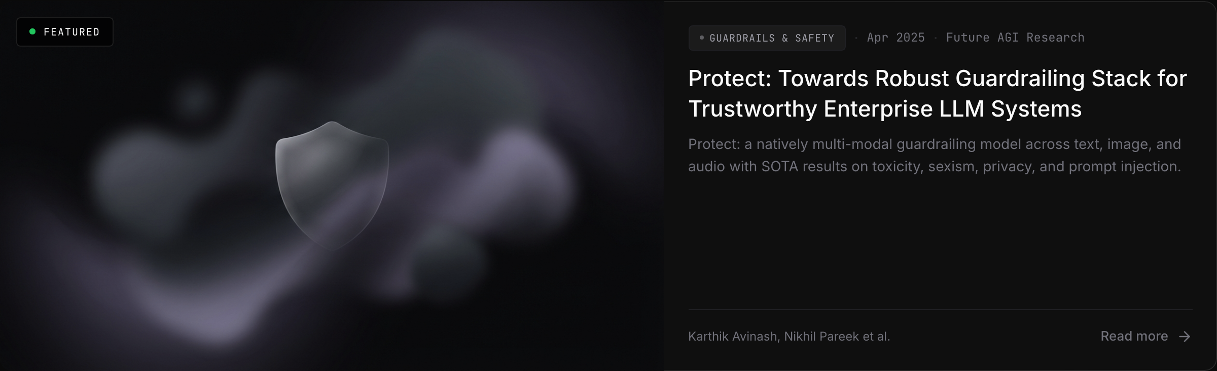 Why the card pattern: the paper page itself is austere, title, authors, abstract, link to arXiv. The card is the only marketing wrapper. After the click, the paper speaks for itself.
14. The two calculators + integrations + the SVG library
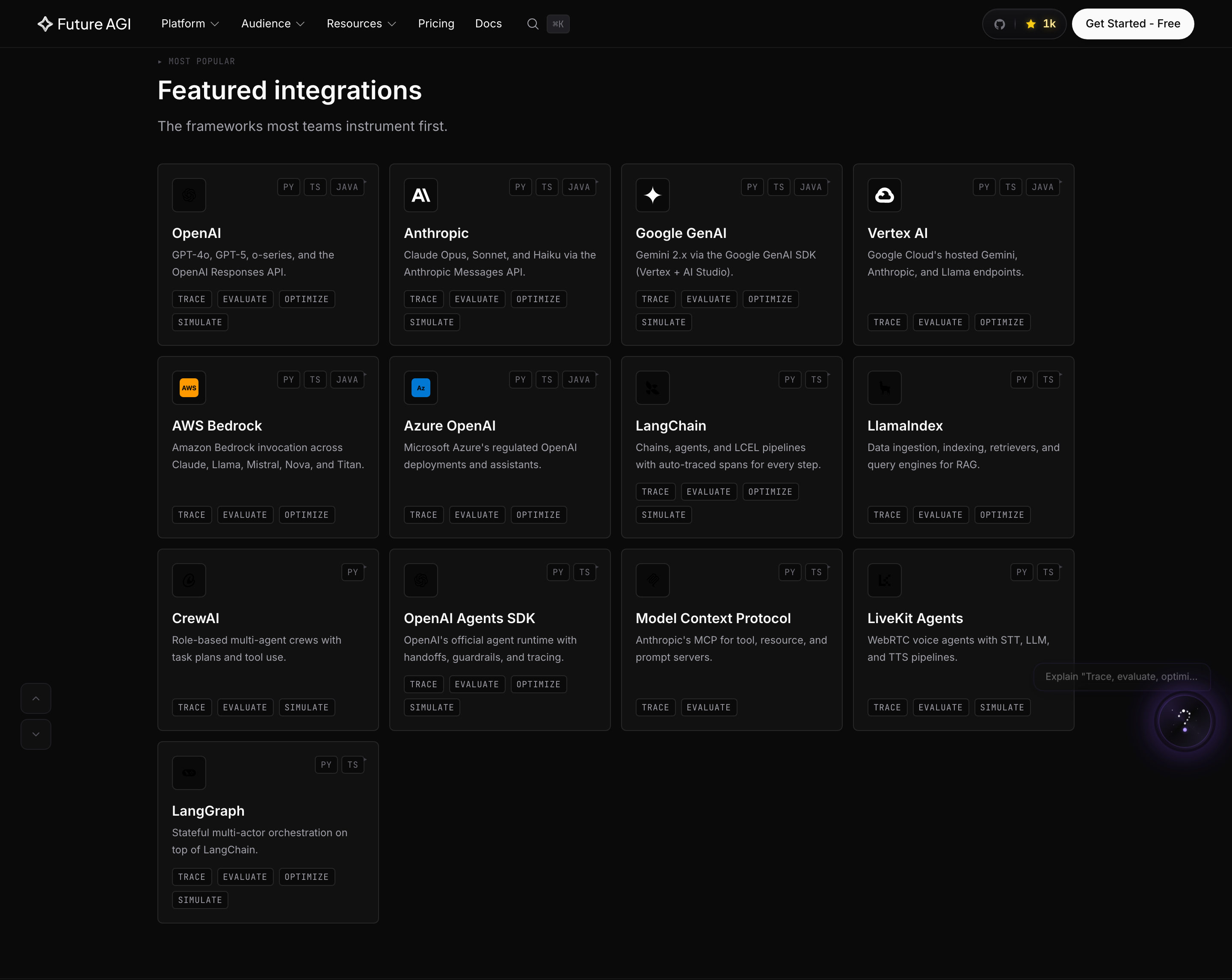 Why a flat alphabetical grid: buyers search “FAGI + my framework” and land on this page. Categorization helps the editor; it confuses the buyer. We chose the buyer.
 Why each tile links straight to docs: the marketing page doesn’t try to re-explain the integration. The docs page does. Two hops to working code.
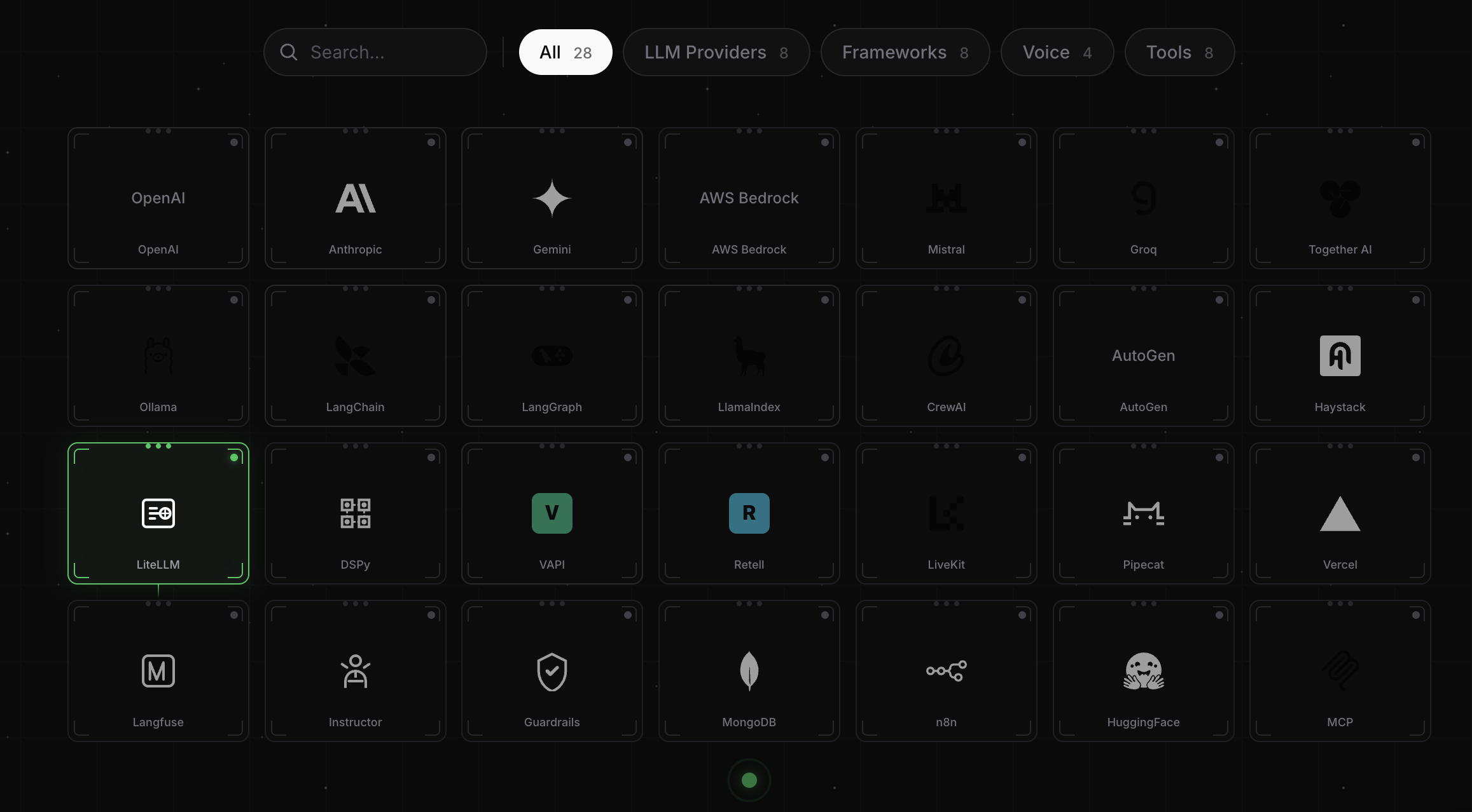 Why a category overlay on top of the alphabetical grid: the flat grid is for buyers who already know what they’re looking for; the categories are for buyers exploring. Both audiences get the same surface, just a different default view. The green LiteLLM highlight is the “selected” state the SDK-docking interaction lands on.
Three more surfaces I want to call out, because they’re the kinds of pages most rebrand posts skip and they’re where the design system earns its keep.
/eval-tco-calculator/, a calculator for the total cost of ownership of evaluation. Inputs: number of model calls per month, number of evaluators per call, average tokens per eval, judge model. Output: monthly cost vs. our Pay-as-you-go pricing. Built as a React island in src/components/eval-tco/. The calculator is opinionated, it shows the math the way an engineer would write it on a napkin.
/llm-cost-calculator/, a calculator for raw LLM API cost across providers. Pick a model, pick a use case, get a monthly estimate. Useful for prospects, useful for us. This one was lifted in spirit from the calculator surfaces we admire on Vercel and Cloudflare, utilities first, marketing second.
Both calculators sit in the footer’s RESOURCES column alongside Customer Stories, Research, eBooks, Handbook, Changelog, and Roadmap. The footer split, Resources vs. Developers, is itself a design decision. Resources is for buyers. Developers is for builders. The split is hard-coded in Footer.astro and reflects an actual buyer/builder taxonomy. Most B2B sites blend them. We separated them.
/integrations/, the integrations page is built on top of a 109-SVG partner-brand library in public/logos/. Every Anthropic, OpenAI, vLLM, Pinecone, Cerebras, Moonshot, Zhipu, Cohere, LangChain, LlamaIndex, Weaviate, Qdrant, xAI logo lives there as a hand-curated SVG. The library exists because pulling logos from third-party CDNs at 32px looks like garbage; hand-curating means every logo stays crisp at any size.
Each integration tile has a hover interaction, a thin green beam drops from the tile toward an imaginary central hub, implying the SDK is “docking.” The central hub indicator pulses with an outward ping, so the metaphor closes. The whole interaction takes 300ms and most users never consciously notice it. The point is the cumulative feel: every interaction on the site teaches you what the product does.
15. The chatbot widget that glows
In the bottom-right of every page on the site lives a 62×62 floating disc, our AI chat widget. It is the single piece of UI I rebuilt most times. I think I’m on version eleven.
The shipped version: a constellation-style ”?” icon inside the disc. Eight ambient stars twinkle at staggered intervals. A dashed gradient path snakes between them. A purple orb at the bottom pulses with three concentric layers, r: 5 → 9 → 5 over 2.5s, opacity: 0.06 → 0.02 → 0.06 in the same window. The disc itself bobs up and down on a 4s aiFabFloat keyframe. A spinning conic-gradient ring rotates around the edge at 8s per revolution. Hover scales it up and brightens the borders. Click opens the chat panel.
Six animations stacked on a 62×62 button. It should be too much. The trick is that the timings are all different, 2.5s, 2s, 3s, 4s, 8s, so nothing ever beats in sync. The widget reads as alive, not busy.
The rejected versions I want to remember:
- Version 3 was a square chat icon with a small badge counter. Too generic.
- Version 6 was a fully animated rocket that “launched” on hover. Too on-the-nose; the metaphor doesn’t need to repeat itself on every page.
- Version 8 was a corner widget that expanded into a permanent panel on the right side of the screen. Took up too much real estate and felt like an Intercom clone.
The eleventh version, the glowing side widget, landed because it does the brand work (constellation = starfield = mission control) without screaming about it. Most users never click. The widget’s job is to be the smallest possible reminder that the product is reachable.
The implementation lives in AiChatWidget.astro and is wired into Layout.astro at lines 423–487. Reduced-motion respect is full, every animation halts cleanly under prefers-reduced-motion: reduce.
16. The 5-element platform hover
The platform dropdown in the top nav is the densest piece of UI on the marketing site, and the single most expensive thing to design.
Hover the “Platform” trigger and a 5-column dropdown drops down. Each column is one of our product surfaces, Agents / Simulations / Evaluate / Guard / Monitor, and each column has a 60×60 SVG illustration that animates differently on hover, plus a list of links into the relevant product pages.
Each metaphor:
| Column | Animation | What you see |
|---|---|---|
| Agents | iterate-spin + wing-deploy + diagnostic-blink + engine-pulse | A ship-like icon spins, wings deploy outward, diagnostic dots blink, engine glow pulses |
| Simulations | 6× tie-fly-* + trajectory-dash | Six fighter sprites fly in different directions; a dashed trajectory line marches |
| Evaluate | ring-rotate + ring-rotate-reverse + crosshair-pulse + target-ping | Two concentric rings rotate opposite directions; crosshair pulses; target pings |
| Guard | shield-ripple ×3 + particle-orbit + threat-incoming | Three concentric shields ripple outward; particles orbit; threats approach in waves |
| Monitor | radar-rotate + blip-ping + data-flicker + bar-grow | Radar sweep rotates; blips ping; data readouts flicker; status bars pulse |

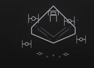

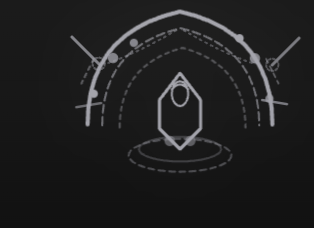
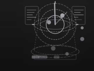
Why every column gets its own visual archetype: a dropdown is a navigation, but this one is also the product family portrait. Five icons, five behaviors, one consistent line weight, the reader sees the shape of the company before they pick a destination.
Five product surfaces. Five visual archetypes. Each one a 60×60 SVG. The dimming logic uses :has():
.grid:has(.product-column:hover) .product-column:not(:hover) {
  opacity: 0.5;
}
.grid:has(.product-column:hover) .product-column:not(:hover) .illustration-svg {
  transform: scale(0.95);
}
Hovering one column dims the other four and shrinks their icons. It makes the dropdown feel like a console rather than a menu.
Five animations in one dropdown is way more than you need. That’s the point. The dropdown is the single piece of UI on the marketing site that does the most aggressive demonstration of “every product has its own visual language.” Six months from now I’ll probably want to simplify it. Today I’m glad I shipped it.
17. Motion, the hyperspace footer + FAGI motion vocabulary
This is the section the post exists for.
The motion stack: GSAP 3.13 (only ScrollTrigger plugin registered), Lenis 1.3 for smooth scroll (lerp: 0.1, cubic ease-out), and roughly 308 hand-written @keyframes rules across src/. No framer-motion. No anime.js. No motion-one. No MorphSVG. No SplitText. The three package is in package.json and never imported anywhere in src/. Every “3D” effect on the site, parallax planets, the hyperspace jump, the orbiting moons, the floating starship, is pure CSS and SVG.
That last sentence is the most important thing in this section.
The hyperspace footer
At the bottom of every page is a footer that reads “Ready for Launch.” Hover the rocket and the entire footer becomes a 1.2-second hyperspace jump. The implementation is in Footer.astro, lines 510–1165.
Here is the sequence, in order:
- The wind-up. On
:hover, the ship pulls back 10px and shrinks toscale(0.98)over 0.18s. A tiny, almost-unnoticeable motion that signals “something is about to happen.” - The streak. Twelve existing background stars convert to horizontal streaks (
scaleX: 0.5 → 3) and fly off-screen left over 0.6–0.8s with staggered delays. Five brighter hyperspace lines burst from the ship’s nose, faster, incubic-bezier(0.16, 1, 0.3, 1). - The jump. The ship overshoots 60px right at
scale(1.05), then settles back to 30px right atscale(1). The overshoot is what makes it feel physical. - The engine flare. Three sequential bursts,
scaleX(1 → 3 → 2.5 → 1.2),scaleY(1 → 1.5 → 1.3 → 1). The flare ramps and decays. Pure CSS keyframes, no JS. - The new galaxy. Three nebula blurs fade in behind. Thirty stars across three depth tiers fade in with parallax drift speeds,
starDriftSlow(60px),starDriftMed(120px),starDriftFast(200px). Three dark planets, three mid planets, four moons, five tumbling asteroids (asteroidDrifttranslates by -350px whileasteroidTumblerotates 360deg). - The settle. Once landed, the ship transitions into a 4s
arrivedFloatinfinite loop. The engine slows to a calm idle. The galaxy keeps drifting.
The whole thing is sequenced :hover chains on .launch-ready-section, each child element keyed to its own animation + delay tuple. Zero JavaScript. Five layers of parallax, an overshoot ease, a wind-up, a settle, an engine cool-down, a star streak, a hyperspace burst, and a new-galaxy reveal, all chained off a single :hover. Representative slice:
.launch-ready-section:hover .ship {
  animation: jumpThenSettle 1.2s ease-out forwards,
             arrivedFloat   4s ease-in-out 1.2s infinite;
}
@keyframes jumpThenSettle {
  0%   { transform: translateX(0)     scale(1); }
  15%  { transform: translateX(-10px) scale(0.98); }   /* tiny windup */
  40%  { transform: translateX(60px)  scale(1.05); }   /* overshoot */
  60%  { transform: translateX(35px)  scale(1); }
  100% { transform: translateX(30px) translateY(-3px) scale(1); }
}
@keyframes engineJumpSequence {
  0%   { opacity: 1; transform: scaleX(1); }
  20%  { opacity: 1; transform: scaleX(3) scaleY(1.5); }   /* burst */
  50%  { opacity: 1; transform: scaleX(2.5) scaleY(1.3); }
  100% { opacity: 0.8; transform: scaleX(1.2) scaleY(1); } /* cool down */
}
The first time Nikhil saw the hyperspace footer working, I had finished it on a Sunday night and dropped a Loom in our shared Slack, he replied with one line at 11:14pm:
“This is the website.”
He was right. This is the website. The brand thesis is ship your AI to production; the footer literally enacts a ship leaving its hangar. Every page on the site ends with this interaction. It is the most polished piece of motion on futureagi.com and the only one that literally enacts the brand thesis.
I want to be honest about one thing: the hyperspace footer does not currently respect prefers-reduced-motion. That’s a one-week fix that should have shipped already. It’s first on the Q3 motion-debt list.
The six signature moves, FAGI motion vocabulary
Across the site, almost every animation is one of six patterns. We call this the FAGI motion vocabulary:
- Fade-up entrance,
opacity 0 → 1,y: 30-40 → 0,power3.out, 0.6–0.8s. Used on every section reveal. Reverses on scroll-back (toggleActions: 'play none none reverse') so the page feels live, not baked-in. - Staggered child reveal, children animate in with 0.05–0.25s offset. Used in card grids, step lists, log tables, dock ports, metric chips.
- Bar fill,
width: 0 → X%,power2.out, 0.6–0.7s. Used in the progress bar under the active hero tab, the pricing calculator, every “running” state. - Crossfade phase transition, opacity-only handoff between two states, ~0.4s overlap. Used inside the hero tabs and the ghost-cursor demos.
- Blueprint line-draw,
stroke-dasharray: 1000+stroke-dashoffset: 1000 → 0over 1.5–2s. Used on every technical diagram and schematic line. Inherited from the brand guide’s blueprint promise. - Twinkle + parallax drift starfield, three depth tiers, three drift speeds, three duration buckets (2.5s, 3s, 4s twinkle). Used in hero, footer, integrations, research, 404, every “void” surface.
back.out(1.5), the only bouncy ease on the site, appears exactly once, on the graph-node entries inside StickyScrollFeatures. Everywhere else is flat power2/3.out or ease-in-out. The single orphan ease is intentional. Bouncy easing landing one place lands harder than bouncy easing landing everywhere.
The 90-second total hero cycle is the biggest motion tradeoff. Six tabs × 15 seconds = 90 seconds. Most users see two. We’re testing tab prioritization based on referring page.
The conic-gradient bezel rotating around the active demo mockup at 4s/rev is the second-most-polished single animation on the site, behind the hyperspace footer. The trick, conic-gradient at inset: -150% under overflow: hidden, is the kind of thing I want every CSS animator to steal.
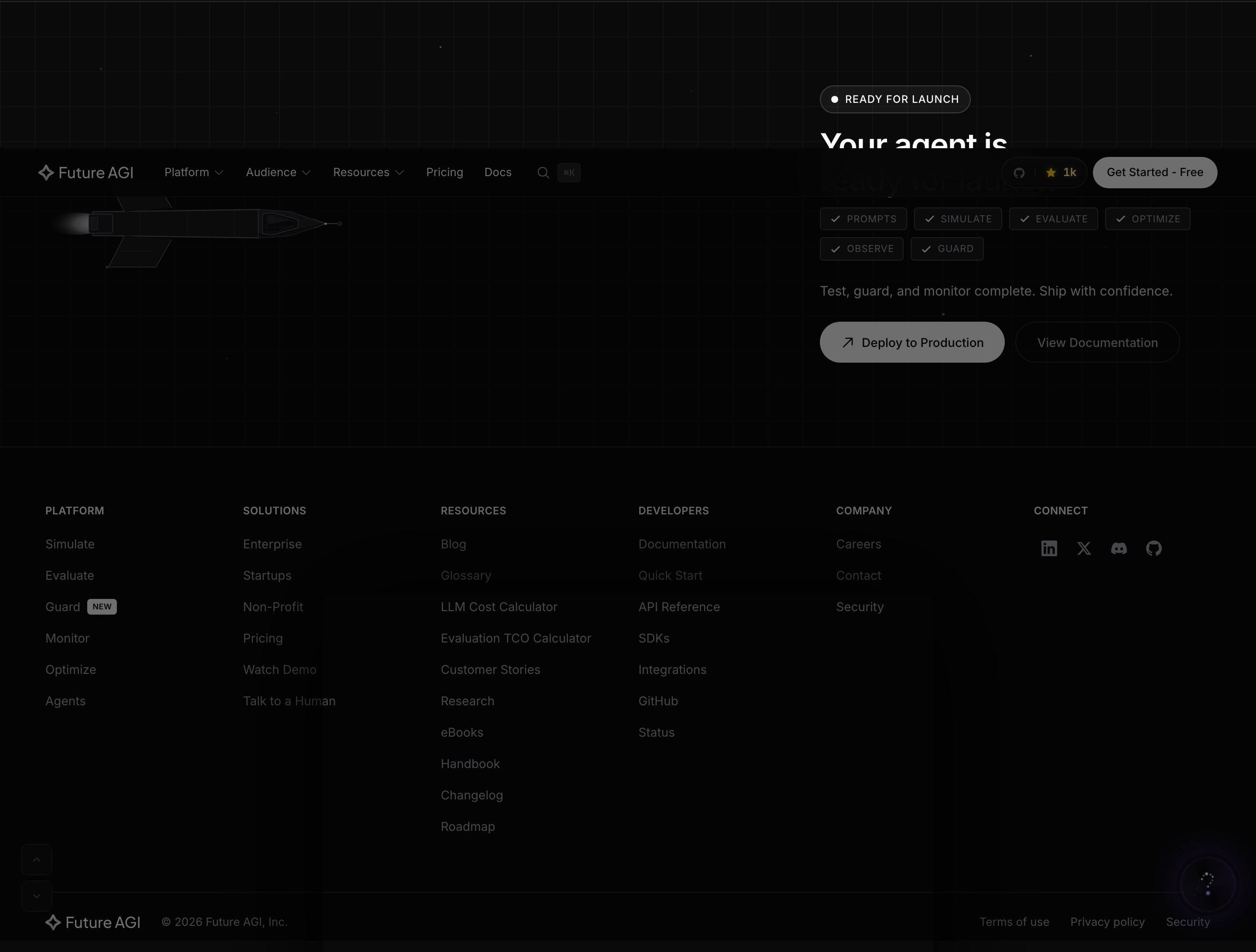 Why this is the loudest moment on the site: every other animation is restraint. The footer is the one place we let the brand sing. The first time the founder saw it at 11:14pm on a Friday in March 2026 he said “This is the website.”
18. Voice, the rewrites that took longer than the design
I want to give voice its own section because most rebrand posts skip it, and I think it’s where most B2B AI sites lose.
The voice rules we wrote into our voice guide:
- Direct. No fluff. “Your AI will hallucinate”, not “AI systems may exhibit hallucination behaviors.”
- Technical. Use the language of the engineer who buys our product. Span. Trace. Eval. Token. Gateway.
- Confident. We know AI. We’ve solved this layer. No hedging.
- Slightly edgy. “Your AI will hallucinate. We make sure no one finds out.” is bold. We’re fine with that.
The single most underleveraged design decision on the site is the rewrite of every page’s copy. Compare two columns of headlines:
| Before | After |
|---|---|
| ”Next-generation observability for LLM applications" | "AI Agents hallucinate, fix it faster." |
| "Comprehensive enterprise-grade evaluation platform" | "Self-improving evals. Not just LLM-as-judge." |
| "Powerful monitoring solutions for AI" | "See every step your agent takes." |
| "Industry-leading guardrails for production AI" | "Block hallucinations, before they reach your users." |
| "Best-in-class observability for AI applications" | "Mission control for agents in production." |
| "Estimate your bill" | "What does it actually cost?" |
| "Contact Sales" | "Talk to a Human” |
The Before column is interchangeable. The After column is ours.
A protected list of words sits at the top of our voice guide: honest, actually, real, specific, concrete, production, calibrated, practical, measurable, verifiable, transparent, genuine. These words can never be cut from a page to fit a length limit. We learned this the hard way in a description-rewrite pass that stripped “honest” from 108 blog posts to fit a 155-character SERP limit. We restored every one of them. The voice is the product.
A banned list, in the same document: delight, vibrant, thrilled, comprehensive, enterprise-grade, stakeholders, alignment, synergies, best-in-class, industry-leading. None of these words appear anywhere on futureagi.com in 2026. We grep for them in CI.
The 877-post blog content engine and the 1,751-entry glossary both run through the same voice rules. Every blog post on futureagi.com that mentions Future AGI does so with the same vocabulary: span, trace, eval, gateway, ship to production, mission control. The blog isn’t a separate brand surface. It’s the same surface, scaled.
The glossary deserves its own line. 1,751 entries is more than most companies in our category have total blog posts. Each entry has a definition, a “Why this matters in production LLM and agent systems” section, a “How Future AGI handles this” hook, a measurement guide, common mistakes, an FAQ, and a related-terms grid. Every entry ends with the same handshake CTA. The glossary is the most underrated piece of content infrastructure we ship, it’s where prospects discover us via long-tail SEO and where the voice rules earn their keep.
The blog categories on the index page (/blog/), All 877 / Guides 521 / Research 205 / Articles 105 / Engineering 21 / Webinars 11 / News 9, surface the post counts inline with the labels. That decision is honest and useful. Most blog sites hide the count. Ours tells you immediately that this is a Guides-heavy resource (521 of 877), which positions the site as a content engine, not a newsletter.
19. What we cut and what’s still rough
This is the honest section.
The illustration system is still placeholder in places. The brand guide promises a unified “technical white-line patent-drawing” style across product pages. We have it on three pages. The other four ship with geometric placeholders. The full illustration library is a Q3 project and the single biggest gap between the brand guide and the shipped site.
/platform/ returns 404. There is no marketing overview page for the platform surface. The navigation jumps straight into individual product pages via the 5-element hover dropdown. This was a conscious cut, we ran out of time and bet that nav-first discovery was acceptable. The site audit (and my own conscience) says it’s not. Building the platform overview page is the next thing I ship after this post goes up.
/about/ returns 404. There is no team page. Designers always look for the team page first; ours is missing. This is the surface I’m most embarrassed about. The fact that we have a research page and a handbook but not a team page is a real ordering mistake. Coming in two weeks.
The product naming pass didn’t finish. The guardrails product is “Guard” in nav, “Protect” in hero copy, and “Agent Command Center” in docs. The codebase still internally calls it “prism.” The page architecture is correct; the names are not yet aligned. Naming is a separate cross-functional project. We shipped the redesign with three names for one product. That’s a real tradeoff.
The homepage hero has a 90-second total cycle. Most users never see tabs 4–6. We know.
prefers-reduced-motion is only partial. The Header dropdown, the chat widget, and the marquee loops respect it. The homepage demo timeline and the footer hyperspace jump do not. This is the most embarrassing motion-system gap. A one-week fix that should have shipped already. First on the Q3 motion-debt list.
The docs site still feels separate. docs.futureagi.com runs the same design system but lives in a separate Astro app (the product-docs/ submodule). Visual language is close but not identical. The fact that Agent Command Center only appears as the explicit product name on the docs landing, and not on the marketing pages, is the single biggest naming-consistency issue on the site. Reconciling docs and marketing is a 2026-Q3 project. Until then, the docs site is honestly half a visual generation behind.
The pricing comparison table on mobile is the worst mobile experience on the site. Feature names clip and wrap. Horizontal scroll kicks in. Flagged for fix.
Some of the lazy-loaded product GIFs on platform pages render as gray placeholders if you scroll fast. Either move them above the fold so they load eagerly, or render a poster-frame static fallback. We’re doing the latter in Q3.
Four near-identical copies of @keyframes twinkle live in Hero.astro, Footer.astro, Integrations.astro, Research.astro, and 404.astro. Should be promoted to global.css as a shared utility. Mild tech debt; viewers never notice.
A redesign that doesn’t have a list this long is hiding things, not finished.
20. What’s next
The post-redesign roadmap, in priority order:
/about/, the team page (two weeks)/platform/, the overview page (three weeks)- Illustration library complete across all product pages (Q3 2026)
- Product naming reconciliation: pick one name for the guardrails product (Q3)
- Full
prefers-reduced-motionparity across hero and footer (Q3) - Docs-to-marketing visual reconciliation (Q4)
- Brand page on
futureagi.com/brand/, a public version of our brand guide (Q4)
None of this is hidden. It’s the work that’s coming.
This isn’t the final destination. It’s the version of futureagi.com that finally feels like the company we are.
21. Credits
This was a small project with a big footprint.
Vision and direction: Nikhil Pareek, founder. The starship metaphor was his. So was the conviction to ship without an illustration library and accept the tradeoff publicly. So was the late-night palette review that killed my teal accent and saved the brand. He drove the rewrites of every page’s copy. He fought for the handbook. He fought for the public roadmap. He chose Agent Command Center over Guard.
Design and front-end: Velalagan (“Vel”), that’s me. Every component, every interaction, every CSS keyframe in this post is something I drew or wrote or argued for. The hyperspace footer ate three of my weekends. I would do it again.
Engineering, the Future AGI engineering team in Bangalore shipped the Astro 5 + Tailwind v4 + GSAP build that lets the design actually move. They put up with my “can we change 0.16, 1, 0.3, 1 to 0.18, 1, 0.28, 1” pull requests at 1am. They built the supabase plumbing behind the pricing calculator. They wired the chat widget. They never complained about the 308 keyframes.
The customer who, in January 2026, told us our hero “reads like every other AI startup.” This wouldn’t exist without that email. If you’re reading this, thank you.
If you like how we build, we are hiring. Design, engineering, DevRel, research. The roles are on /careers/. The handbook is on /handbook/. The roadmap is on /roadmap/. They’re all real pages now.
- Vel
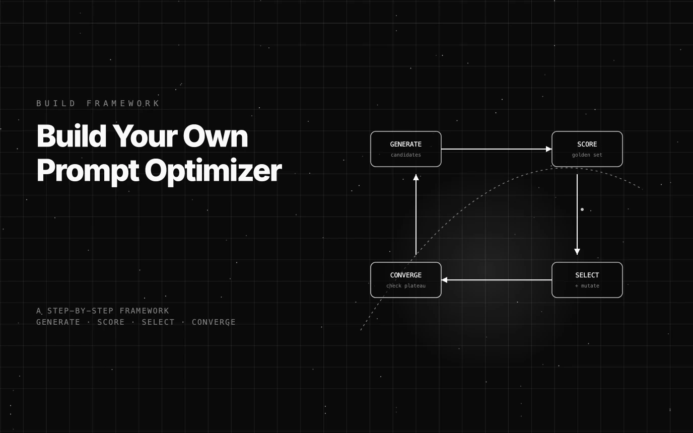
A framework-agnostic build guide for a prompt optimizer: candidate generation, golden-set scoring, selection, and the failure modes nobody documents.
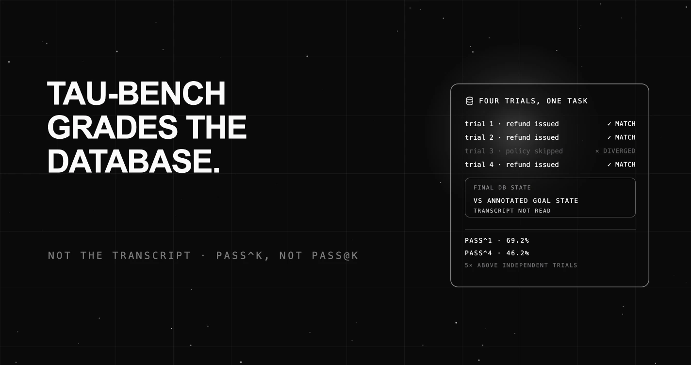
Tau-bench grades agents on database state after a conversation with a simulated user. What pass^k means, and what the published curves say that the mean does not.

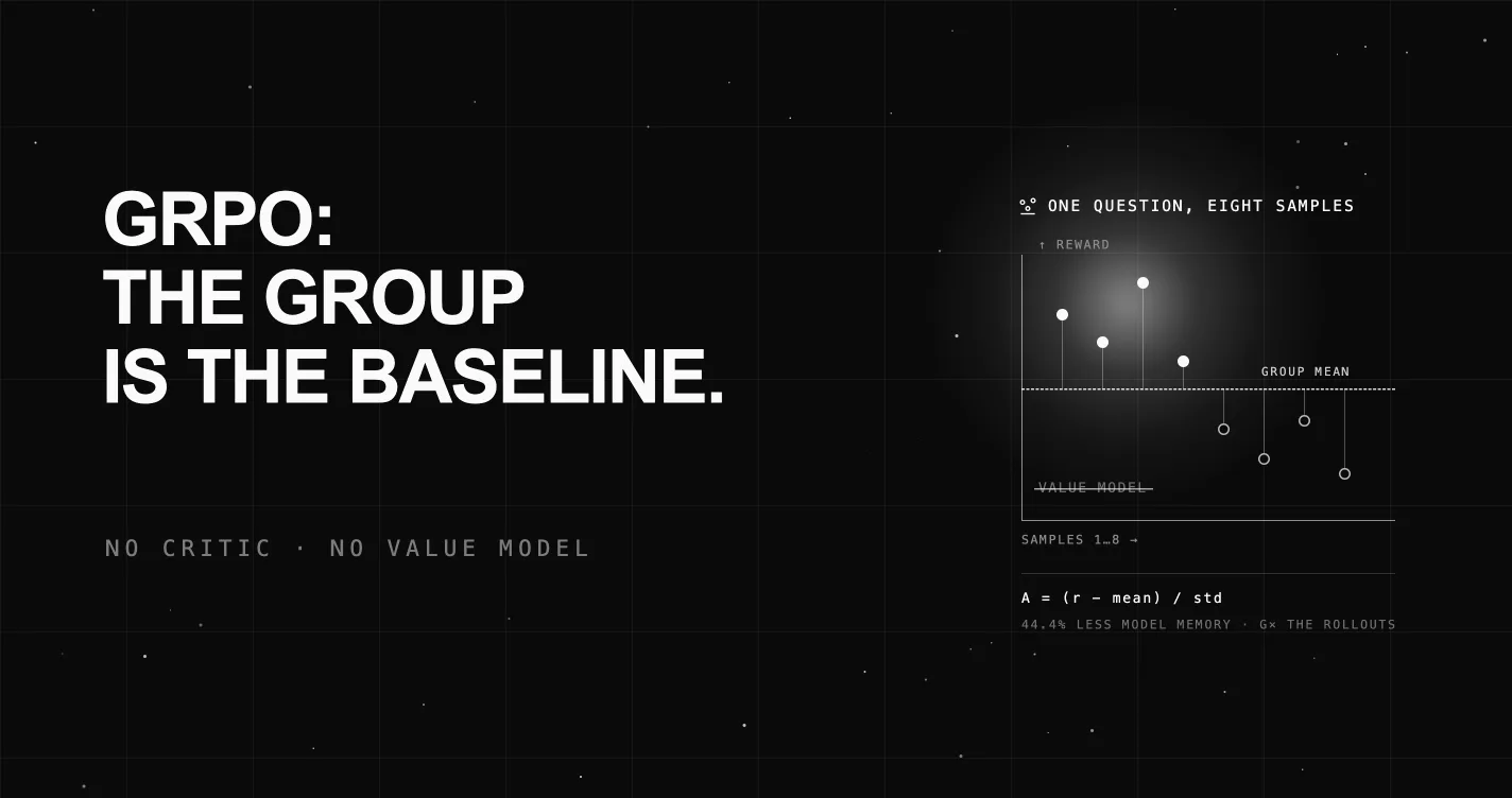
GRPO drops PPO's critic and estimates the baseline from a group of samples. The advantage formula, what it saves, and why group size lands at 8 to 16.